
The number of Covid cases has been soaring in our area, as I documented in an earlier post. Given the rates in the surrounding counties, we are fortunate that (as of January 5) there have only been seven cases among independent-living residents (including both Kendal and Crosslands). Another 30 are being monitored, either because of symptoms or exposure, so there are likely to be a few more.
But our staff has been hard hit, “with close to 60 persons out of work due to a COVID-19 positive test result, a direct or significant household exposure, or the monitoring of their symptoms” according to CEO Lisa Marsilio’s memo on January 5. “Staff members who test positive are home in isolation.”
The weekly numbers from the Chester County Health Department are the worst ever. As of January 7, the new cases per 100,000 for the preceding week stood at 1162 (that comes to about 166 per 100,000 per day), and the test positivity rate was 28%–both far higher than the previous records.
Still, there is starting to be reason to hope that the worst may be over.
The number of new cases reported each day appears to be leveling off in Chester County and in neighboring Delaware (PA) and New Castle (DE) counties. The charts below show the most recent daily data from the New York Times. The day-by-day changes have not yet had a significant impact on the 7-day and 14-day averages, however.
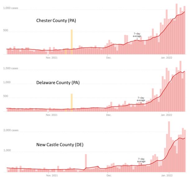
According to Covidestim.org, the estimated Rt value for our county (which indicates the rate at which a newly-infected person infects someone else) is back down to just 0.96. That is slightly lower than 1.0, the level below which the number of new infections starts to decline.
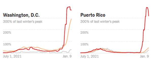
At the state level, infections in Pennsylvania are still growing rapidly. But in a few places that were hit early by the Omicron surge (such as the District of Columbia and Puerto Rico), case counts are actually dropping a bit. In these charts, you can see the downward trend. Note that these are six-month graphs in a narrow window, so the time scale is greatly compressed compared to the three-month daily charts above.
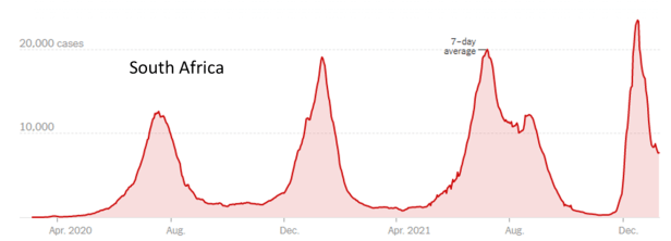
Dare we hope that the case counts will follow the same curve as they did in South Africa a few weeks ago? There, the drop in cases was just as steep as the rise had been. Here’s what the latest New York Times two-year chart for South Africa looks like.
It will also be worth keeping an on the UK. In the UK (where Omicron took hold later than in South Africa but earlier than in the US), cases have leveled off. Watching the level of new cases in the UK over the next week or so should give us a better idea of whether the pattern from South Africa will be repeated there and, potentially, elsewhere.
