
Recently, Crosslands resident Warren Gifford sent me links to articles noting the drop-off of marriages in China, its future population loss, and the fact that India recently passed China as the most populous nation. That got me thinking about population more generally.
There are still many people worrying about world overpopulation. Should they be? And what is the population future of the US?
We can get a pretty good handle on these questions by looking at population pyramids.
In this post, I’ll begin by looking at the world population, then at the examples of a few selected countries, and finally I’ll have a few words about where the US population is headed (including the importance of immigration).
A population pyramid is a diagram that shows how many people of each age live in a given region. The youngest people are at the bottom and the oldest at the top, which means the top comes to a narrow point, something like a pyramid. Each layer of the pyramid represents a given age group, and those groups will move upwards, year by year, as they age. Some will die, which means each layer will get skinnier as it moves up (unless it is supplemented by immigration).
Here’s the population pyramid for the world population. By convention, the male population is shown on the left, and the female population on the right.
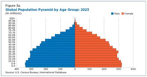
World population pyramid. Source: https://www.census.gov/library/stories/2023/11/world-population-estimated-eight-billion.html
The tapering toward the top is obvious. A little less obvious is the fact that the youngest layers, at the bottom, aren’t growing any more. In fact, you can see a slight shrinkage. If these youngsters have the same level of fertility as their parents, the shrinkage will continue.
It will take a long time for those young generations to rise to the top of the pyramid. During that period (which will last until sometime around 2100), the world population will continue to increase, because each successive generation is a bit large than the previous one. But then the population should stabilize.
Individual countries. In countries where there is substantial narrowing at the bottom of the pyramid, the overall population will start to shrink. This is happening in China, whose “one-child” policy a few decades back has resulted in a couple of generations with substantially reduced numbers and an overall population that is headed for decline.
Japan has already been experiencing that kind of generational decline for many decades. Here’s what that pyramid looks like:

Japan’s population “pyramid”. This doesn’t look much like a pyramid anymore, because the younger groups have gotten smaller. Source: https://population.un.org/dataportal/home
The largest group in Japan’s population are in their 50s (born in the 1970s). A lack of younger workers is causing real problems in Japan. Among other things, it has triggered a strong push for development of robots to take over tasks that young workers would otherwise do.
In most parts of the world, changing family-size preferences and the availability of contraception have resulted in stable-to-slightly-lower population expectations.
Where there is still growth. Some parts of the world are still growing fast. According to the UN, just eight large and growing countries account for more than half of world population growth: the Democratic Republic of Congo, Egypt, Ethiopia, India, Nigeria, Pakistan, the Philippines, and Tanzania.
Tanzania is a good example of a country where the growth shows no sign of stopping. Each 5-year group is larger than the last, giving a pyramid that looks like this:
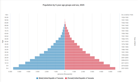
Tanzania’s population pyramid. Each generation is larger than the last. Source: https://population.un.org/dataportal/home
Tanzania’s pyramid is an example of the classic pyramid form that caused demographers of a previous generation to predict a population catastrophe. This type of pyramid is a rare case now, however. Even among the eight countries mentioned above, only four show this shape. The rest show signs of slowing.
Consider Egypt. It was growing fast, but has been experiencing declining birth rates for the past decade. Here is that pyramid. Notice the narrowing at the base.
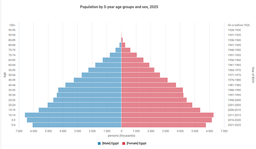
Egypt’s population pyramid. Source: https://population.un.org/dataportal/home
What about China and India? At the beginning of this post, I mentioned that India has passed China as the world’s most populous country. Both are still growing, but their growth is slowing. Here are their pyramids:

China (left) and India (right) population pyramids. Source: https://population.un.org/dataportal/home
As China’s pyramid shows, China has had three decades of ever-lower birth rates—far lower than it would need in order to end up with a stable population. It is probably headed for overall population decline. India’s shift has been slower, but it too has experienced lower-than-replacement birthrates for two decades.
Shifts like these are happening across the globe, which means that a stable (or maybe shrinking) global population is within sight.
What about the US? Like other developed nations, the US has a birthrate that is below the level that would be required for a stable population. Here is our pyramid:

US population pyramid. The narrow base indicates that our population is headed for decline. Source: https://population.un.org/dataportal/home
Although our population pyramid shows that we can expect a declining population, our population level is actually much steadier than it would have been without one stabilizing factor—immigration. If immigration is shut down (and that is what seems to be happening right now), we will be heading for the same kinds of workforce problems that Japan is facing.

Thanks, George. The visuals are very helpful in understanding what is happening/can be expected.
LikeLike