
In response to a question at the meeting of the Kendal Residents Association today (March 13), Seth Beaver promised a diagram showing exactly where the proposed footprint of the healthcare expansion project would be, to be posted in the Center within a week or two. Seth’s diagram will be the official answer to the question, of course. But I realized that some of the questions residents have could be answered by a much cruder diagram.
What I have done is to overlay the outline of both the current and expanded healthcare wing on top of a Google Earth image of the current building and its surroundings. I traced the outlines from documents that were shared last summer. Those documents did not show the surrounding area, but with the outlines superimposed on a Google image, you can get a good idea of the context. In the image, you can see a rough approximation of where the proposed expansion will be, relative to the existing features of the area: parking lot #1, the Dog Park and its trees, and the Blueberry Meadow.
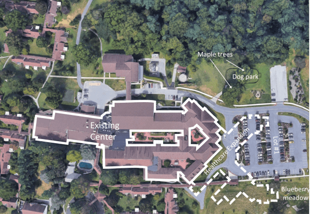
I can’t guarantee that the diagrams I used as the basis for this image are the final, definitive versions. Some details could have changed since last summer, so please wait for Seth’s diagram for that. I the meantime, though, I hope this will be helpful, at least in a general way.
